Build better WordPress sites.
GenerateBlocks is a small collection of lightweight WordPress blocks that can accomplish nearly anything.
Install NowIntroducing the new addition to your web design stack.
Add incredible versatility to your editor without bloating it with tons of one-dimensional blocks. With GenerateBlocks, you can learn a handful of blocks deeply and use them to build anything.
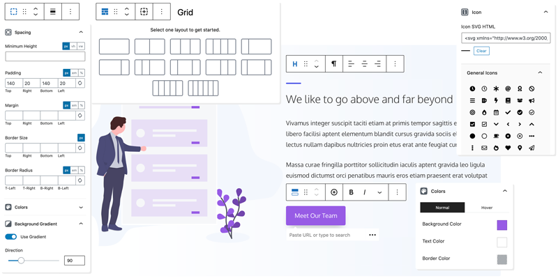
Container
Organize your content into rows and sections.
Headline
Craft text-rich static or dynamic content.
Button
Drive conversions with beautiful buttons.
Image
Add static or dynamic images to your content.
Grid
Create advanced layouts with flexible grids.
Query Loop
Build a list of posts from any post type.
Created for the Control Freaks
Convert your designs into stunning websites with precision controls.
Typography
Select from Google or Local fonts and fine-tune every aspect with sizes, weights, and spacing.
Spacing
Adjust padding, margins, and borders for pixel precision control over your layouts.
Colors
Cascade colors from containers to content. Adjust backgrounds, borders, links, and text.
Gradients
Extend your color range with custom gradients to add clever shading or subtle overlays.
Backgrounds
Add background images and control their size and position like a CSS Ninja.
SVG Icons
Use your own custom inline SVGs in your buttons and headlines.
Performance in its DNA
Built to outperform the competition.
From the same development house as GeneratePress, you know the code of this plugin is secure, stable, and super lightweight.
Performance
Deliver lightning-fast sites built with clean HTML5 code, dynamic CSS, and without code dependencies.
Endlessly Flexible
With these four blocks, you can build almost any layout, style any content, and produce any design.
Responsiveness
Create stunning sites designed for any screen with device-level controls and advanced flexbox grids.
Coding Standards
Built to the highest coding standards for security, stability, and future compatibility.
See what our users are saying.

GenerateBlocks is hands down my favorite new plugin and has turned me into a block editor (Gutenberg) fan. I’ve never liked page builders due to bloat, and this is the missing piece to the puzzle. It’s insanely lightweight, and I’ve already used it to convert all my sites (blogs and ecommerce) over to be entirely block-based. No custom code needed. It also pairs beautifully with GeneratePress.
Brian Jackson, Co-founder, forgemedia

I demand top performance from any WordPress solution I use. Every other page builder failed to meet my speed requirements until GenerateBlocks was created. Now we have the flexibility and power to make beautiful pages without having to custom code everything from scratch. Convenience with top-level performance in a page builder is finally here thanks to Tom!
Mike Andreasen, Performance Specialist at WP Bullet

Looking for a WordPress theme? GenerateBlocks and GeneratePress are built with the same principles in mind and complement each other perfectly.
